What is A 'Selfie'?
Did you know, that woman aged 16-25 spend an average of five hours a week taking selfies, and posting an average of three selfies a day?A selfie is a photograph/art piece of your face or body, a representation of a person, it shows emotion and characteristics.' The Selfie' mainly evolved and became popular due to social media and technology, it became a 'trend', however that is not where it began, the first ever selfie was taken by Robert Cornelius in 1839 it was a daguerreotype, a daguerreotype is a photographic process which creates positive and negative images. The inclusion of front facing cameras on smart phones and the popularity of social media sites like Instagram and Snapchat have made the posting of Selfies increasingly popular as a form of photographic self-expression. So, why do people take selfies? In the olden days people used selfies as a way of expressing themselves and showing others their characteristics, they were used to capture certain moments and places. Over the years that has changed, people nowadays take selfies for mainly these three reasons, To convey emotion, To show beauty and to enhance self-esteem, after their selfie is taken they then post their selfies to social media where the image is exposed to criticism and being judged. What are the advantages to 'selfies'? Selfies are like mirrors with a memory, you can capture yourself or you can look at pictures of old family members even though they could have died way before you were even born! And are their any rules? No! Selfies are perfect for experimentation, you can make your selfies distorted, abstract, colourful, etc.
Vivian Maier
Vivian was a street photographer during the 1900's, she worked as a nanny and in her free time she would take photographs in her spare time, she was able to take 150,000 in her lifetime however she never shared these photographs, she kept them all as a secret this led to people thinking that Vivian was quite a strange and a mysterious woman, she liked to keep her life to herself. Her photographs were portraits, of herself and others. All of her pictures were black and white and they each expressed emotions. Vivian was really good at looking, she would look at a certain scenery and pick out what part of it she would photograph.
As Vivian kept all of her photos a secret they weren't shared till after she had died, this is called posthumous. Vivian became famous after she had died, this happened because of a certain man discovering her exposure in an auction sale and later deciding to gather them all together and sharing them online which led to her work being displayed in galleries, newspapers, etc.
As Vivian kept all of her photos a secret they weren't shared till after she had died, this is called posthumous. Vivian became famous after she had died, this happened because of a certain man discovering her exposure in an auction sale and later deciding to gather them all together and sharing them online which led to her work being displayed in galleries, newspapers, etc.


Ilse Bing
Ilse was a german photographer, she bought a camera in 1928 and taught herself photography. Ilse gave up a lot for photography, one of those things being her thesis in the summer of 1929 to concentrate on photography, this suprised her family.
Ilse's photos varied, she took portraits, she took photos of movement, photos of destroyed and abandoned buildings, her photos were all black and white and they all had interesting composition and framing. Her photos were unusual, some used props and were planned out whilst others were hit and run images.
Ilse's photos varied, she took portraits, she took photos of movement, photos of destroyed and abandoned buildings, her photos were all black and white and they all had interesting composition and framing. Her photos were unusual, some used props and were planned out whilst others were hit and run images.


Lee Friedlander
Friedlander's life evolved around photography, he wrote many books and won many awards about/from his works. Friedlander began photographing the American social landscape in 1948 and began taking self-portraits in the 1960's which were then published in a monograph by Fraenkel Gallery in 2000. Many of Friedlander's photos included fragments of store-front reflections, structures framed by fences, posters and street signs.


Our Selfies
These are the photos that me and my partner took as a intro to the selfie project, some of them are overexposed and some are underexposed, we were trying to play around with the camera setting to create interesting photographs. I think that our photos came out quite well, I especially like the ones that we used the mirrors and the shadow ones, I think that working together helped come up with creative ideas. (finish writing this)


Favourite & Least Favourite Selfies
|
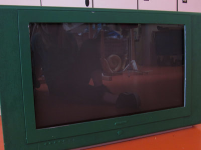
This selfie is my favourite. I like the look of the old tv, it has a dark neutral green colour which contrasts to the bright orange floor. You can see my reflection and some of the artwork in the back, if that artwork wasn't there I don't think I would like this image as much, inside the tv there is a lot going on whereas outside it there isn't much. If I were to improve this selfie I may have changed the angle that it was taken at, I would try to get more artwork into the frame and less in the background.
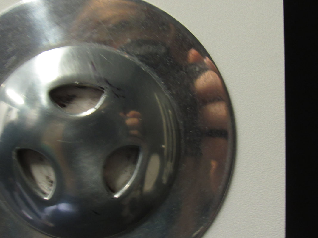
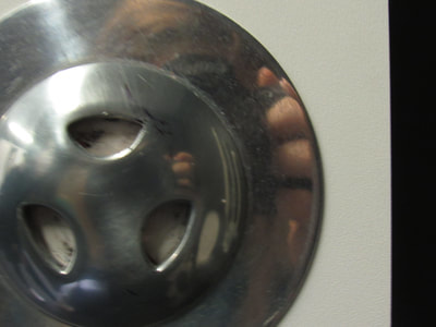
This selfie is my least favourite. I don't like this selfie because one, the framing isn't too good, I should have put the lock in the middle or only half of it in. The lock is quite dirty and scratched up and I moved the camera whilst taking the picture which made it turn out quite blurry. There isn't anything interesting to look at in this selfie. The only thing that I like about this selfie is the small shine of light in the top left corner of the lock, this is what I look at first when I see this image.
|
Edited Wrong Pictures
|
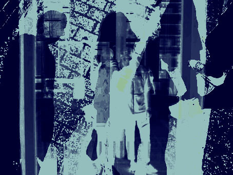
This image was created on photoshop. It uses three different selfies. I think what worked well in this photo was the fact that the first two images, the window selfie and the board go really well together, it almost looks as if we are one of the images that were on the board and I think that looks quite cool. However this is my least favourite edit, I feel as if this one is the most plain and too packed. If I kept it only as the image of the board and the window selfie and left out the shadow picture this image would look better, the shadow image doesn't look too bad with the other two but it would look better if I left it as two images and added more effect like maybe a different colour choice and made the text from the board more visible than it is at the moment.
|
|
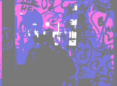
This image was created on photoshop. I quite like this image, I like the colours and how the graffiti on the mirror looks, its quite abstract. This image is composed of three different images and I think that these images work quite well together. I like the way in which the colours contrast against each other. When I started editing this image the colours were REALLY bright, I struggled in finding a way to tone the really bright blue down as I didn't really know what all of the tools do and I didn't want to tone down the other two colours however I found out that it looks quite good, it looks slightly flat but it kind of goes together. I like how plain I look in this and how full the background looks.
|
|
This image was created on photoshop. In this image I tried to create something different in comparison to my other images as they were all turning up quite bright. This image is more neutral compared to the other three of my images, its not as interesting but it looks different. If I were to improve this image I would make the other image more visible and maybe make it a contrasting colour to the dark blue. I quit like how the bricks on the floor look, it adds a interesting texture to the image.
|
|
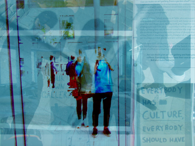
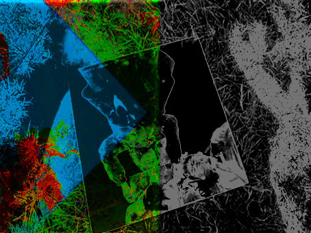
This image was also made on photoshop. This one is probably my favourite, I like how the image is split down the middle, one side is black and white and the other one uses quite bright colours. At first glance you can't really see that this is composed of two different images, at least I wouldn't, however when you look at the coloured half you can see that this is a different image, I like how this looks, its different than my other two images as in those ones all of the images were overlaid whereas here the images are overlaid however not fully. What I would improve in this image is the effects on the coloured image, I think I should have left the image as it was when I first put it down and only added minor adjustments.
|

|
This image is showing me editing the previous image on photoshop.
|
Obscured Selfies
The task of this lesson was to go out and take obscured selfies. We took inspiration from artists such as Delaney Allen, Arnulf Rainer, Richard Hamilton, Yayoi Kusama and more. Me and my partner took some clear paper and went down to the art department to grab some paint, we found some bright red paint and painted it onto the paper leaving some blank bits. I think that the painted selfies came out quite well, the angles could have been better and we should have left more empty space. We also used some yellow habit stickers and stuck them on a mirror, these selfies are probably my favourite, they do repeat a lot but they look quite good. I also liked to idea of taking a photo whilst the person is moving which creates a blurred affect. We also took a few reflection selfies, they came out ok but they're quite regular and not interesting. I think that we could have taken more imaginative selfies however it wasn't really our fault as there wasn't much equipment or spaces at school that we could use.


Making a Book
https://howdidyoumakethis.com/stab-bound-journal/
https://www.youtube.com/watch?v=s9P07WAbYHs (inspiration for creating the books)
https://www.youtube.com/watch?v=YlUyrlUflZw
https://www.youtube.com/watch?v=s9P07WAbYHs (inspiration for creating the books)
https://www.youtube.com/watch?v=YlUyrlUflZw
Selfies From Out of School


Chosen Selfies
I have chosen these images as I believe that they are my most successful selfies. Most of my selfies are reflection selfies, I found those the easiest and most interesting to take, my least favourite selfies to take were shadow selfies as they were the hardest to take and make look unique (which mine don't look unique). I also liked the photos that I edited on photo shop, I think that they look fun and different in contrast to my other selfies. My selfies don't really have a theme they're all different from each other.


Cover of Selfie Book
This is the image that I have made to use as my front cover. I used my phone to edit one of my selfies. I used the apps: Snapseed, Picsart and Phonto. I named my book 'Personification' as the book is going to contain my self portraits and is supposed to be all about us and the title is basically saying that I am this book in some way. I took inspiration from photography books and liked the idea of having my title at the bottom edge of it.

