I think that abstract photography is probably the most experimental type of photography. Abstraction doesn't have on single definition however one way to put it would be that: abstraction is when a photographer focuses in on a certain part of a natural scene, isolating it from its context and leaving the parts that deemphasize the relationship between the photograph and object. One way to create an abstract photograph is to look at the line, texture, colour, shape and form in the photograph and isolate or eliminate one that may interest you, leaving other parts more exposed than before or exposing them less. Abstraction can be created in many ways, its up to you in which way you want to create it.
https://klaudiaczar.tumblr.com/
Formal Elements
- Focus Which parts of the photograph are blurry (out of focus)? Which parts of the photography are clear/sharp (in focus)?
- Light Which part of the photo is darker? Which part of the photo is lighter? Can you guess what time of day it it? Do the lines create direction on the photograph? Are they outlining something? Do the lines create movement?
- Repetition Are there any objects, shapes or lines which repeat and create a pattern?
- Shape Is there any geometric figures? Is there any organic shapes (curved)? Where are they?
- Space Does the photograph have any depth? What creates this? Is there any negative or positive spaces?
- Texture If you could touch the surface of the photograph how would it feel? How do the objects in the picture look like they would feel?
- Value/Tone Is there a range of tone? Where is the darkest and lightest value?
Formal Element Photos
In class we were asked to pick out one formal element to focus on and go out and take photos focusing on that formal element. I think that my photos turned out okay, we didn't have much time to take them because the people that I was working with kept having camera issues that we had to sort out. I think that I found it hard to only focus on one element, this is because when I saw something interesting I wanted to take a photo of it despite the fact that it wasn't focusing on my element. I think that abstraction is one of my faults, I like abstraction but i'm not too sure on how to take abstraction photos. The formal element that I was meant to focus on is tone, this didn't go well (as I said) and I did take some shape and light photos too. My favourite photo is the 11th one, it's a photo of the gap between two doors, I like this photo because the one line of light is surrounded by complete darkness. My least favourite photo is the one of the camera reflection, I don't like this photo because you can see exactly what it is, it generally isn't a good photo and was a slight accident.


This is a worksheet that was completed in class.
|
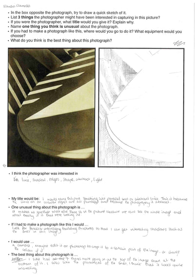
This is a photograph by Paul Strand. It is entitled 'Abstraction, Twin Lakes, Connecticut'.
I think that the photographer was interested in: line, shadow, edges, shape, abstraction and light. This photograph uses a lot of different elements, I think that the main element that is used is line (or maybe light). My title would be: I would name this piece something like 'Parallel Lines' or 'Abstract Lines'. This is because the lines of the surface are all parallel and the photo is abstract. One unusual thing about this photograph is: it makes us question what else there is on the photo because we cant see the full image and are stuck with this section only. This is quite common with abstract photos, it isn't usually clear what it is thats in the photograph. I would use: camera (obviously), I would most likely edit the photograph on photoshop, crop it, change the colour of it, etc. I think that photoshop could be a useful tool for future abstraction projects. The best thing about this photograph is: I like that theres more going on at the top of the photograph than at at the bottom of it. I like the placement of the lines, I think it looks quite interesting. I also like the tonal differences in this photo, there is more shadow than light, most of the shadow is at the bottom of the photograph. |
Man Ray
Man Ray, August 27, 1890 - November 18, 1976, was a visual artist, he was a significant contributor to the Dada and Surrealist movements. His major works covered a variety of media however he considered himself a painter, however he was best known for his photography. Especially for his work with photograms. His photograms mainly consist of everyday objects and metal items. His experiments with photography included rediscovering how to make "cameraless" pictures, or photograms, which he called rayographs.


Harry Callahan
Harry Callahan was a abstract photographer, he was born on the 22nd of October, 1912 and he died on the 15th of March, 1999. Callahan left almost no written records—no diaries, letters, scrapbooks or teaching notes yet he was regarded as one of the most influential figures in post-war photography. Callahan’s photography is exploratory rather than evolutionary. He chose a subject, photographed it for awhile, left it, did other things, and then returned to it, usually from a changed perspective.


Alfred Steiglitz
Alred was born on the first of January in 1864, and died on the 13th of July in 1946. He was a American photographer and modern art promoter. Alfred was studying engineering at school however later returned to New York determined to prove that photography was a medium as capable of artistic expression. This influenced many generations of photographers, painters and sculptors directly and indirectly. He was known by many as "the father of modern photography." Alreds photography focuses on the sky and clouds.
I chose this photographer because he takes photos of the sky that make it seem really interesting as the sky is something that we see everyday and there are many photos of it making it quite a regular sight and making each photo extremely similar to one another however Alfred makes the regular seem irregular and makes the sky into something different.
I chose this photographer because he takes photos of the sky that make it seem really interesting as the sky is something that we see everyday and there are many photos of it making it quite a regular sight and making each photo extremely similar to one another however Alfred makes the regular seem irregular and makes the sky into something different.


Keld Helmer-Peterson
Keld Helmer-Petersen was born in the year 1920 and died in 2013. Keld was a Danish photographer Keld is known for his images of structures, patterns and details found in cityscapes and nature. He started photographing in the late 1930s and first made his name with 122 Colour Photographs in 1948. Petersen used a very high contrast to achieve the look of his photographs, he has also published books designated to this particular type of abstract photography.
I chose this photographer because I like the contrast between negative and positive images in his work. His work also has interesting compositions.
I chose this photographer because I like the contrast between negative and positive images in his work. His work also has interesting compositions.


Aaron Siskind
Aaron was born on the 4th of December, 1903 and died on the 8th of February, 1991. Aaron's photographs emphasise the modernist concern with the flatness of the picture plane, but intensified his approach to picture making - with close-up framing, as well as emphasis on texture, line, and visual rhymes - creating abstract images of the real world.
I chose this photographer because most photographers take photos of perfect structures, clean areas, etc however Aaron takes photographs of the imperfect without trying to make it perfect. This gives his photos emotion. I also like the composition and textures in Aaron's work.
I chose this photographer because most photographers take photos of perfect structures, clean areas, etc however Aaron takes photographs of the imperfect without trying to make it perfect. This gives his photos emotion. I also like the composition and textures in Aaron's work.


How to Make a Photograph Like Aaron Siskind
- Keep your photos black and white
- Compositions are quite packed
- Variety of themes
- Pictures mainly of destroyed areas
- A lot of texture
- A lot of contrast
- Rarely take photos of people


Photos in the Style of Harry Callahan & Aaron Siskind


Photos in the Style of Harry Callahan & Aaron Siskind Edited
These are my edited photos of my attempt to take photos in the style of Harry Callahan, I have changed the saturation and sightly increased the contrast and shadows. I like the contrast in tone in the second and third images, this works well as it Harry's photos also do have quite a tonal contrast, this means that my photos have been successful as I do think that they look quite a bit like Harry's. The one thing that I do think I could change is, making the first and last photos lighter, I think that I might have made them too dark, however this isn't a major change and I do believe that the photos are successful regardless.


Abstract Photograms
This is a gallery of abstract photograms (not taken by me). I chose these because I thought that they were really interesting and visually attracting to me. The photo that I like most out of these photos is the last one. I like this photo because not all of it is in focus, the top part of the photogram is slightly blurred whilst the bottom part of the photogram is in focus. I also like the tonal difference between the different objects, the bottom of the photo has the lightest tones whilst the middle part of them photogram has the darkest. You can't exactly see whats going on in this photograph I think that's what makes it abstract. Another photo that I like the most out of these is the second one on the bottom row, I like this photo because it has a really interesting composition, the objects are hard to identify however they have interesting shapes with different tonal values.


My Photograms
Our task was to create 3 abstract photograms. I think that my images turned out okay, they are abstract however they could be improved. I think that I could have experimented with more objects rather than the chemicals and movement. The first photogram is the least abstract of the three, I tried to experiment by moving the paper whilst it was being exposed however I moved the paper too fast and therefore nothing was changed. The second photogram was created with string and it turned out the way that it is because instead of dipping it into the developer first I dipped it into the fix and then the developer after, this created the weird blur and lines at the edge of the image. In the third images I experimented with moving a lightbulb whilst the paper was exposed to light, this didn't work the way I wanted it to because it blurred way more than I expected, this would've been different if I moved it slower.


Abstraction Homework
Our task was to go out of school and take 20 abstract photos. I think that this homework was quite easy. Some of my images are most obvious than others. When I first began taking photographs I was focused on making it unclear to what it was that was in the photo however I later realised that every image it abstract because the world is 3D and photographs are 2D and therefore even though the object was clear the photo would still be abstract. My favourite photograph is the 4th image (the weird street lamp), I like how I composed this image, the lamp, even though it has colours similar to the clouds, stands out against the background. The image that I like the least is 5th image (edited pavement picture), I don't like this image because of the colours that I have used and because the angle that it was taken at makes it interesting.


Final Piece Research (Other classes)
|
Circle cut outs with water ripple images:
Photograms with random words underneath:
Ripped paper with image behind it:
School Building, Abstract Structure:
Geometric Photogram Composition:
Sky and Cloud Cut Out Images:
Photograms cut up into small pieces:
|
Photo book Research & Final Ideas
There are many types of photo books, the pictures that I have used below are the simplest type of photo books, for example, the first photo book that I created was a origami foldout (explosion squash book), it can be found on the edges page under component one. When you are making a photo book it is important to consider:
- The subject matter: What is the book going to be about?
- Cover design: The cover is the first thing that will be seen, what can you do to make it stand out?
- Strength of the Photography: What makes the photographs you have chosen stand out? Are they meant to communicate something? Do they suit the subject matter?
- Page Layouts: Has the placement of the images seem based on conscious choices or is it haphazard?
- Text: Is the font easy to read? Is there going to be a overwhelming amount of writing?
- etc.
I think that i'm going to create a few large minimalistic photograms, that include both positives and negatives, and cut them into smaller pieces then reorganise them and mix up the pieces from each photograph to create a few larger images, I would make sure to measure out how big I want the smaller pieces to be and cut them with the trimmer to make sure that they are accurate unlike the ones in my previous photo book (can be found by going to component one and then going to the edges page). I would have around 10-20 pages in my photo book, I believe that I should keep the page size as a4 so that there is a white border around my photos. I would like to keep my photos black and white but I may experiment with adding accent colours in some of them to keep them from being the same, I would do this by editing them on photoshop. Another idea that I came up with is finding a book that doesn't have many pages (maybe one with poems) and sticking my photograms on each page.
A few exemplar photo books:
A few exemplar photo books:


Photoshopped Images
Our task was to use one of our previous photographs or photograms and photoshop them. In the first one I used two of my photographs and in the second one I used a photograph and a photogram. I think that the first image turned out okay, there isn't a specific focus in it and its quite random, when I was editing the images I wasn't really thinking much about what I was doing and I was just experimenting. I like the second image, its really dark and seems quite eerie. When I was creating this images I knew that I wanted to come up with something creepy and distorted and I think that it came out the way that I wanted it to.


My Photo Book Images
For my photo book images I decided to go with the element of shadows and light. I chose this these two formal elements because I thought that it'd be quite interesting to explore. In some of the images the shadows have been created with natural light and in others I have used a flashlight in a dark room and shined it on different objects. I think that most of my images came out quite successfully, I especially like the photographs of the plants and the shadows which have a rainbow highlight to it (they're shadows of a diamond). I think that my images could have turned out even better if I spent more time finding objects that create interesting shadows and maybe taken some images outside during the sunset and taken photographs of the shadows of interesting structures and other things.


My 'Dummy' Photobook
We were asked to create a 'dummy' photo book of what we would like our final photo book to look like, I have chosen to stick my photos in a book. What I am going to change for my final photo book is that I will make sure that my photos are cut out neatly and I want to use a poetry book that has white paper to keep it formal. I will also have to create a cover for it (as I have done for the dummy one) which I want to keep minimalistic to match the rest of the bool.


Cut Up Photograms & Duotones
These are a few of my photograms that I have made for my board. I think that they are okay. I switched the position of the objects after four seconds to create a interesting effect. I like the first photogram, I think that it came out quite well, the string came out quite bright and although the background is really dark there is a faint outline of the string. At first I didn't really understand how this process was supposed to work and it wasn't working for anyone at the beginning, I was expecting the photograms to just turn out white however Mrs explained to me that photographic paper doesn't block out light and that the light would shine through to create a inverted photogram.


These are the duo tones of my cut up photograms. I like how the first and last photograms look. I like the first one because of how abstract it turned out, everything is quite bright apart from the string which is really dark in comparison. I created the duo tones by uploading my scanned photograms onto photoshop and then inverting them. This was a easy task. I think that I will use this method in my final piece along with the regular inverted photograms.


My Board
|
We gathered all of our photograms and our duotones and have created a single board featuring both photos. Whilst I was making the board I had to consider the composition of my images. I think that my board came out looking okay, I don't really like how messy the composition came out and they way that some of my images have been cut as it makes it look quite messy. If I made another board I would reconsider the composition and I would make sure to spend more time making sure that the images have been cut straight. What I do like about my board is that as each side is a different tone they sort of blend into each other which makes the board quite interesting.
|
Photograms for Photobook
These are the photograms that I have made to cut up and use in my photobook. At first I was planning to make loads of small photograms and stick them into random pages of the book that I have bought however in the end I decided to make larger photograms, cut them into smaller pieces and stick them onto random pages of my photobook. When I was making the photograms I was mainly focusing on experimenting and making them abstract. In some of my photograms I have tried to shift the position of the objects every second to create movement, this worked really well. Next time I will try to expose my paper for more time so that it turns a darker colour and the contrast is greater.


Photo Collage

|
This is my photo collage that I have made using five previous abstract images that I have taken. I enjoyed this task, I found it quite interesting. Whilst I was making my collage I was focusing on where all the lines in each photo were and how I can combine them into one collage. Although, I think that the main focus in this task was composition as we had to find a way to compose them altogether onto one page. I think that my collage was successful. I think that the colours of the different photos work really well together, the darker tones are quite similar to each other along with the lighter tones. The composition seems quite packed as there is a lot going on, in this collage there isn't one specific focus point although I do think that the cut out lamp stands out because its lighter than the one that was already in the photo. If I were to improve my collage I would use a trimmer instead of ripping it with a ruler.
|
Photoshop
In class we were asked to take some of our previous photos, upload them to photoshop and experiment with the different tools that we have available. Here are some of the images that I have created. I think that my images have been quite successful, I especially like the first image and the fourth image that I have created. My least favourite image is the third one, although they are all abstract and think that this one looks quite strange. I really liked this task, I think that it allowed us to be imaginative. Some of the tools that I used to create these images are: spot healing brush tool, healing brush tool, history brush tool, rectangular marquee tool, etc.


Saul Leiter
Saul Leiter was an American Photographer and painter, he was born on the 3rd of December in 1923 and died on the 26th of November 2013. Saul's family encouraged him to pursue photography, he began by taking black and white photographs and in 1948 he began to take coloured photographs. His life as a photographer was very successful, he had many opportunities, ones such as: working as a fashion photographer, featured at the museum of modern art, became the subject for a documentary, etc.


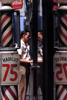
|
This is my favourite image from Saul Leiter. I mainly like the composition and colours of the image. The composition of this photograph almost seems as if it is sectioned into different lines, some trips are less packed than others creating a interesting effect overall. I like the colours in this photograph due to the contrast between the bright red of the sign and blue of the sky and the contrast of the white and the black.
|
My attempt at Saul Leiter's Photos
Most of the photos here are all blurry, they don't have a specific focus, this is because the camera that I was using didn't have the right lens in order for me to be able to recreate Saul's photos. I don't think that these photos are successful, it isn't obvious enough that they were inspired by Saul Leiter as they're all really different and look random. I think that in order to improve these photos I should have tried to be more experimental with them, I could have found better locations that had more colour, I could have also tried playing around with the different camera settings. I think that my most successful image from this set is the fourth one as its out of focus and has some colour.


Saul Leiter's Paintings
As well as being a photographer, Saul Leiter had also created many paintings. The composition of his photos and paintings its quite similar however the colours used in is paintings greatly differ from those used in his photographs, the colours that Saul uses in his paintings are a lot more colourful, fun and pastel as oppose to the dark and vibrant ones used in his photographs.


Compare and Contrast

|

|
- Composition is similar. They are most busy in the top left corner and the least in the bottom half.
- It is easy for us to name the objects in the photograph however, the painting is abstract and its hard to tell what the objects are.
- Both the photo and the painting are in portrait.
- The photograph has been created digitally with a camera whilst the paiting was created by hand and then scanned in.
- Some elements of the photograph are out of focus,
- The photograph is black and white whilst the painting uses many different colours. The tones in the photograph are a lot darker than the ones in the painting.
My Attempt
Here I was attempting to recreate one of Saul's photos, however instead of taking a photograph I have recreated it as a painting. I think that this was fairly successful, if I had more time to paint this, I'm sure that it would have turned out a lot better. This is successful as I think that the puddles (or possibly paint smears?) look fairly similar to the ones in the photo. The colours aren't the same however the tones of them are quite similar. Due to the low quality of the watercolours and the paper, you can see the paintbrush strokes, if this were a painting, I would most likely not want them to be there however in this case, I think that they represent the textured road pretty well.

|

|
These photos are inspired by Saul Leiter. I was attempting to recreate his photos by creating out of focus images of people and buildings. I think that the outcome of these photos is really successful, I especially like the last three, I think that they look the most like Saul Leiter's photos as the rest of the use quite vibrant colours whereas Saul Leiter uses a lot of darker tones and primary colours. In order to make them more successful, if I had a chance to take these photos out of school I would've been able to make them appear more like Saul's.


Curtis Moffat
Curtis Moffat


Unusual Place Photoshoot
This is a set of photos that I have taken of a 'unusual' place, I went with a classmate to an abandoned farm that resides next to my house and these were the images that I took. I think that although most of these photos are really simple, this a pretty successful set of photos. I have taken most of the photos at a distance in order to get more elements into the photo.


